Deconstructing this Year’s Oxfam Davos Report – What Makes it so Good?

Duncan Green explores Oxfam's annual Davos report: The Inequality Virus.
I know this is the week of Blue Monday, when we are all supposed to feel at our most miserable, but I’m not feeling it – this is the time of year when I am proudest of working for Oxfam, because of its annual Davos report.
For several years now, this has focussed on inequality, and I honestly think (though I’d hate to have to prove it) that these annual reports have helped push inequality up the public agenda. Other factors = Occupy, big books by Piketty, Milanovic and others and, errm, the actual facts of rising inequality. Try distributing attribution among that lot….
On Tuesday, Anthony Kamande expertly summarized this year’s report, so I won’t repeat that. Instead I want to dissect it a bit as a piece of ‘research for advocacy’. Spoiler, I think it’s brilliant.
First the style – the lead author, Nabil Ahmed (@NabsIMA), backed by Anna Marriott, Nafkote Dabi, Megan Lowthers, Max Lawson and Leah Mugehera, writes with sustained passion and precision – a rare and wonderful combination.
Second the format. A punchy 8 page executive summary, with lots of highly tweetable infographics. That summarizes a 48 page full report that few people will read, at least this week, but which gives solidity and confidence to the activists referring to it, and full transparency (321 footnotes!) to anyone wanting to check the thinking and calculations behind the headlines. If that’s not enough, ubergeeks can find a 22 page paper on the methodology behind the stats.
 Eight pages may be a bit too long for an executive summary, and I would have liked a 2 pager, but I guess the thinking was that the infographics do that job instead.
And the killer facts! Here’s a sample:
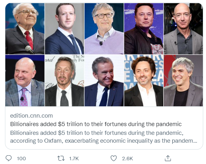
- The wealth of the 10 richest men has doubled, while the incomes of 99% of humanity are worse off, because of COVID-19.
- Inequality contributes to the death of at least one person every four seconds.
- 252 men have more wealth than all 1 billion women and girls in Africa and Latin America and the Caribbean, combined. Good to see the attention to both gender and racial inequality growing with each report.
- Since 1995, the top 1% have captured nearly 20 times more of global wealth than the bottom 50% of humanity.
- Twenty of the richest billionaires are estimated, on average, to be emitting as much as 8,000 times more carbon than the billion poorest people.
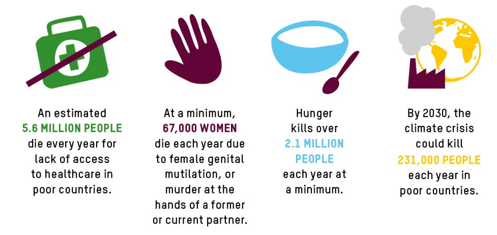
This may look simple, but killer facts take a lot of work from the unsung heroes – Oxfam’s researchers toiling away on the stats. All this is backed up by some nifty 15 second videos, ideal for twitter.
Global campaigns are all very well, but most political change takes place at national level, so Oxfam also churned out hundreds of national killer facts on inequality for 66 countries to supplement the global ones. These helped ignite national debates on the super rich and inequality, for example in Vietnam, Ireland or Nigeria. The exposure of President Uhuru Kenyatta as one of the five richest Kenyans certainly got the debate going in Kenya.
These kinds of campaigns work better as alliances; Oxfam works closely in particular with the Fight Inequality Alliance, a movement that started around five years ago and continues to grow. This year it is also working at the other end of the spectrum, with the Patriotic Millionaires, a growing group of super-rich people from different countries demanding more taxes. Had Davos gone ahead in person, there were plans for Abigail Disney (grand daughter of Walt) to lead a protest with pitchforks outside the conference itself, which would have given the journos the ultimate ‘man bites dog’ story.
And all backed by a huge investment in press work (online and offline, national and international) – check out the heat map two days in.
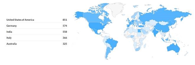
Heat map of media hits so far (excluding broadcast)
I asked one of the inequality team for their impressions on which aspects of the report have had initial ‘cut through’ and got this:
‘The ten men stat has had the most cut through along with the historic and unprecedented explosion in billionaire wealth. The role of inequality in someone dying every four seconds is doing very well too – it is a great fact in that it links up the economic inequality with issues like health and gender-based violence.’
Which more than bears the recipe for a good KF – a juxtaposition that exposes a deep injustice.
The report covers 3 broad areas:
- The unprecedented rise in billionaire wealth during Covid-19
- Economic Violence (the impact of inequalities in health, gender-based violence, climate change and hunger)
- Solutions (importance of social movements, and policies around pre-distribution and re-distribution)
What impact does all this have, building on a decade or so of annual inequality-fests, which were even louder when Davos met in person (it’s been postponed this year due to Covid)?
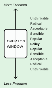 My hunch is that the biggest impact has been on overall narratives rather than specific policies. This is about getting inequality into the Overton Window (left) – as an acceptable topic of public debate and political response. That’s where big, bold messages are most effective, and the inequality campaign has been brilliant at these. I suspect fewer people will read/be influenced by the ‘solutions’ section, but it has to be there, if only to respond to journalists and others who say ‘well what would you do?’ Even if the honest response to that might be ‘we’re pointing out the problem; it’s down to the people we elect to fix it’, you have to give some pointers to prove your own credibility and hopefully influence the inevitably protracted and complex search for solutions.
The final lesson is the importance of staying power – as far as I can work out, the first Davos inequality report came out in 2013. It didn’t actually have that much impact. That changed with the 2014 report, where it came up with the now-legendary killer fact that ‘just 85 people owned as much wealth as the poorest half of humanity.’ That put faces to the inequality, making it much more media-friendly than a juxtaposition of percentages. Subsequent years saw the 85 people shrink to just 6, as the wealth of the super-rich escalated.
So overall, a top job, and I’ll be recommending it to my students who start this week on the course I teach on Advocacy, Campaigning and Grassroots Activism. Thanks for the case study, guys!
Here’s another powerful video via Nabil – a whole minute this time (seems like the days of the leisurely 30 minute powerpoint are numbered!)
I’d be interested in other thoughts/reactions.
This first appeared on the From Poverty to Power blog.
